2021-11-11

Windows的KVM软件

 KVM即是共享鼠标键盘。

之前Windows和Ubuntu我都是用Synergy,不过最近一查发现变成收费软件了。

Github上有个fork叫Barrier,下载以后配了好久也不好用。有可能跟我的屏幕配置有关系,一个电脑连了多个显示器,而且有的显示器还是禁用。最后放弃了。

后来搜到了微软的Mouse without Borders,简单配一下就能用了,还是不错。

网址是http://aka.ms/mm

2021-11-01

Euclidea 14.5 解法与证明

Euclidea 14.5

如图,给定三个两两相切的圆,O,O_1, O_2。三个圆心共线。

任务:尺规作出一个圆,与给定的三个圆都相切。


解法:


  1. 设圆O与圆O_1的切点为A
  2. 连接OA
  3. 过O做OA垂线交圆O于D
  4. 以D为圆心,DA为半径作圆,交圆O_1和圆O_2于E和F。
  5. 作直线EO_1和FO_2交于G
  6. 以G为圆心,GE为半径作圆
  7. 圆G即为所求圆


简要证明:

  1. 如图,设三个圆切点为A,B,C。明显A,B,C,O,O_1,O_2五点共线。
  2. 以A为中心作反演变换,取反演圆与圆O_2正交。于是圆O_2经反演变换后不变。B,C互为反演点。
  3. 分别过B和C做AB的垂线L_B和L_C。易知圆O1和圆O经反演变换后分别为L_B和L_C。
  4. 如图作圆G'同时与圆O_2,L_B和L_C相切于E'和F'。
  5. 过E'F'作直线L,易证C在L上,并且∠E'CB为45°。
  6. 设L经过反演变换得到的圆为圆D',考虑圆D'的性质:
    1. 直线AD'与直线L垂直
    2. 圆D'经过A(因为L不经过A)
    3. 圆D'经过B(因为L经过C,而B,C互为反演点)
  7. 于是可知圆D就是圆D',因此E和E', F和F'分别互为反演点。
  8. 设圆G'经过反演变换为圆G''。因为圆G'与L_B和圆O_2相切于E'和F',所以圆G''与圆O_1和圆O_2相切于E和F。
  9. 所以G''即是EO_1和FO_2的交点,且圆G''半径是G''E。于是圆G即是圆G''。
  10. 因为圆G'与L_B,圆O_2,L_C都相切,所以圆G与三个给定圆都相切。证明完毕。

参考资料:Pappus chain


2021-04-28

再度音乐寻宝

平时脑子里会无缘无故,不由自主地蹦出一些旋律。这些旋律很熟悉,也肯定不是自己现编的,但是就是想不起来具体的名字,歌手或者哪里听到的。

最简单的情况是记得歌词,或者可以哼唱检索。最难的大概是影视作品的配乐,我觉得成功的配乐会让人记得当时的“感觉”而不是曲子本身的细节。

继上次音乐寻宝之后,又一个旋律出现了,令我吃不香睡不着。

经过几天的查找,最终还是找到了,结果是井上昌己的《Up Side Down 永遠の環》,出自圣少女的ED。过程还是挺有趣的。

1. 我大概记得开头intro的旋律,以及歌词的整体节奏,类似词牌。然而试了若干哼唱检索,都没有结果。
2. 我大概记得一些歌词片段,于是去各种网站搜索。然而结果证明我记忆的片段是错误的。
3. 我“感觉”这是一个日本动画的ED, 于是去搜索了80 90年代引进的日本动画, 以及00-08年流行的日本动画的OP ED,然而没有找到。这个比较巧妙,因为圣少女国内引进过,但是节选了OP和ED。我其实也翻了日版动画,大概看了前几集和后几集的OP ED,万没想到结果是中间的。
4. 我“感觉”动画是跟魔法少女有关,所以翻了翻魔卡少女樱和Marybell的乐集,一无所获。当时其实也过了一遍圣少女的乐集,不知为何漏掉了。
5. 后来放宽了条件,搜了一些类型相似的动画乐集,虽然没找到当前这个,但是意外找到了我的女神里的《優しい心》。这个也是以前突然蹦出来的旋律。同时翻到了同作品里的《願い》,感觉跟要找的相似,然而其实没啥相似,除了都是欢快的曲子。
6. 于是放弃了,能试的都试了,只能随缘了。
7. 后来调整了下思维,想到有没有可能是其他类属性。于是翻了一下邓丽君的日文歌集,甚至《梅兰梅兰我爱你》,当然还是无果。
8. 最后真的是随了缘,重翻了一下圣少女的乐集,竟然找到了。

这个过程里我觉得最有趣的是两点:
一是我记忆里的“感觉”,日本动画, ED, 魔法少女。这样的记忆比曲子本身深刻一些。这也让找曲子更困难了一些。
二是我记忆里的不确定因素,包括旋律歌词。我试想过多种可能的乐器组合,以及歌词韵脚,感觉都有可能。最后也证明我这部分记忆都是不准确的。

2021-04-26

Notes on Color #9: Color Calibration

In January, as part of the preparation for digital painting training, I calibrated my laptop display and my pen display. Yet in April I realized that images look quite different on my laptop, on the pen display, on my phone or on others' devices.

After hours of research, trail and error, I managed to learn more principles and calibrated my hardware and software. Here are some notes:

1. Colorimeters are not spectrometers. Instead of measuring the full (visible) spectrum, the main goal is to simulate a standard observer (with three color receptors), or XYZ values.

2. Due to #1, there are assumptions made here and there to cut down the cost without hurting the quality too much. However an important aspect is the type of monitor (e.g. WLED, WLED+phosphor, GB LED,  RGB LED, OLED etc.).  The chracteristics of each type is diffrent, mostly on the "base spectrum". The calibration may look off if the wrong correction matrix is used. Note that old colorimeters might not support newer display technologies.

3. The default "Photos" app in Windows does not support embeded color profiles in images. I'm now using XnView MP.

4. Chrome (and likely other browsers) usually support embeded color profiles, however it'd be safer to simply convert the image to sRGB when upaloaded to the Web. The reason is the color profile may be stripped or incorrectly processed by the websites.

5. Chrome by default uses the default color profile (for the current monitor) of the system. It might make sense to change it to sRGB.

6. After trying a few calibration tools by the colorimter vendors (e.g. SpyderExpress, i1profiler), I still prefer DisplayCAL. Note that it still makes sense to install the vendor software, such that DsiplayCal may import correction data.

7. According to the author of DisplayCAL, ICC v4 is not necessisarily better than ICC v2 in practice. And v2 is way more comptable for now.

8. It might be necessary to verify and recalibrate the displays every month.

2021-04-02

Notes on Color #8: Idealized Gamut Mask

Continuing with the previous post, in this one I'll try to identify the goal of gamut mapping, and to create an idealized model. 

The Color "Wheel"

A quick word with color wheel before we can proceed.

The color wheel arranges all paint (or device) colors (or more accurately, chromacity) in a hue-chroma system. The modern version is the uniform color system (UCS). I'll use CAM16UCS as an example. Here is the full visible gamut under D65, projected into CAM16UCS.
"top view" of the D65 visible gamut in CAM16UCS.
The color at (0, 0) is white.
The colors have been mapped to sRGB.

"Side view" of the D65 visible gamut in CAM16UCS.
Note the chroma is 0 at the topmost and the bottom-most.
The colors have been mapped to sRGB.


Observe that the top view resembles the the color wheel, but it is nothing like a perfect circle. We could say this is our modern version of the color "wheel", which presents chromacity uniformly on a 2d plane.

I also included a side view here. We can see that the volume of is a irregular cylinder-alike shape. The volumne is not regular in any direction, because our eyes are more sensitive to some wavelengths (green/yellow) than others (blue).

The Idealized Model

James once mentioned that the gamut mask could be used to simulate/achieve color grading. While color grading in general invovles multiple aspects such as contract, black level, details etc., I believe the focus here is color balance/correction.

Look at the following image:


After Figure 6.10 from Dale Purves and R. Beau Lotto's book Why We See What We Do; An Empirical Theory of Vision (2003, revised 2011)
Source: http://www.huevaluechroma.com/111.php

The blue tiles in A and the yellow tiles in B are actually both neutral gray without the context, which can be verified by sampling the RGB value of the pixels. This demonstrates our abilitiy of chromatic adaptation. We have to keep this in mind when paining a scene with tinted light, or "mood".

To simulate this effect, I simply took standard D65 illuminant, then muted ~1/3 visible spectra on the blue end. This resulting test illuminant would appear strongly yellow.
Under this illuminant, S cells won't receive any (reflected) light, while L and M cells are not affected much. We will not see any "real" blue (under D65) colors, but grey (under D65) objects may appear as blue-ish.

Cone cell response curves.
Source: Wikipedia


Under such an illuminant, the visible gamut is reduced, as shown below: (we do not consider self-emitting objects here)
"top view" of the visible gamut under the test illuminant.
Note that it is much smaller than the D65 version, especially the blue part.
The colors have been mapped to sRGB.
"Side view" of the visible gamut under the test illuminant.
Note the chroma is 0 at the bottom-most, but large at the topmost.
The colors have been mapped to sRGB.

Observed that almost all blue/purple fractions are missing, comparing with the D65 gamut.

We are not done yet. Definitely it's not the case where blue-purple colors suddenly disappear while all other colors stay the same. We still need to figure out how colors are shifted.

To do so, we study the Munsell colors (at value of 5) under D65 and the test illuminant. 

Munsell Colors (V=5) under D65, in CAM16UCS.
Black dots indicate colors that are outside of sRGB

Munsell Colors (V=5) under the test illuminant, in CAM16UCS.
Black dots indicate colors that are outside of sRGB.
Munsell Colors (V=2) under the test illuminant, in CAM16UCS.
Black dots indicate colors that are outside of sRGB.

Observations and interpretations:
  1. Only the top half of the original gamut is covered by the test version. All the colors are shifted towards the new "white" under the test illuminant, which appears yellow if compared with D65. Some colors are pushed outside sRGB and some are pulled inside.
  2. The yellow (D65) area (black dot on the top) is very crowded, while the blue (D65) area (blue-green dots on the bottom) is sparse. Remember that chroma and hue reflect wavelength and relative strength of the dominanting spectrum, therefore removing blue-ish spectra has much greater impact on blue-ish colors than yellow-ish colors.
  3. Comparing the V=2 version and the V=5 version. As V increases, the center of the Munsell colors is moving from black toward  the illuminant color. This is actually the black/grey/white value scale under the test illuminant. 
Assuming the standard Munsell colors represents a uniform color wheel, the shifted Munsell colors would work as a modern version of the gamut mask.

Comparing with the Orignial Version

Interestingly, the original triangular gamut mask works in a very similar way:
  • The triangle covers the top-center area of color wheel. (More accurately, it is important that the gask is off-center, not necessarily at the top-center).
  • The center of the mask is for white/neurtal grey in the painting
  • At least one primary color is completely out of the mask, we have to use grey or grey-ish color instead.
  • Consider the color at the center of the mask. When we mix the lighter and dark versions, it naturally ( and roughly) follows the path from black to the illuminant color.
I think these may well explain the color science behind the gamut mask method.

Meanwhile, also note that:
  • It is not (always) true that "all colors in the gamut mask may be obtained by mixing the gamut primaries. Paint mixing is not linear, it is somwhere between additive and subtractive.
  • The shape of the gamut should be more like ellipse, if we want to cover the entire chromacity. However that way it'd be difficult to identifiy primaries or to obtain colors inside the mask.
  • We need to pay attention to the white point as well as the distribution/division of hue & chroma inside the mask, which should not be uniform in general.
These a few points might worth some attention when we are dicussing color theories, but they may be far less important when we are painting in practice.

Final Thoughts

In this post I tried to interpret and extend the gamut mapping method with modern color theories. If you agree with my arguments, please stay skeptical and be aware of my shallow knowledge of color science. I would appreciate critiques.

As I mentioned in the last section, while there are a few issues, the gamut mask method works quite well in practice, as it is indeed supported by the color science. I find it fascinating that someone was able to come up with it in the 1920s, which is even earlier than the first modern CIE color space (in 1931).

I also believe that these "issues" won't affect much in traditional painting. Nothing is really mathematically accurate anyways, artists are indeed free to adjust chrome/hue/value, or to decide the shape of the mask. Besides, in real life we rarely see the whole visible gamut. In fact, I believe color harmony implies bias/limiting the palette/gamut.

Regarding digital versions, it is also true that most of the issues may be overcome with decent art skills. Yet I think it is important to be aware and conscious the issues when using the tool. 

On the other hand, maybe I can improve it by apply the method for my Zorn palette. We'll see.


Appendix: More on Munsell Colors

I'd like to discuss a few experiments on the Munsell colors. These do not conflict with the points above, but they are less interesting, so I'll just briefly talk about them here in the end.

When calculating Munsell colors under a specific illuminant, it is incorrect to simply apply chromatic adaption on the Munsell colors. That would affect models "self-emitting LEDs under the test illuminant". But we want "reflecting objects under the test illuminant". 

To simulate real reflecting objects we have to start with the spectral reflectance. I ended up using colour.XYZ_to_sd. But keep in mind that this can never be perfect. Information is lost when we convert a spectral distribution into a XYZ value. Also different two sets of  spectral distribution may correspond to the same XYZ value, which means they look exactly the same (by the idealized observer).

One interesting question, at first I expected blue colors would appear much darker under the test illuminant, because I removed all blue-ish wavelengths. However it did not turn out like that. I briefly examined the output of XYZ_to_sd, it seems keep a fraction of reflection of red-ish spectra, even for pure blue in sRGB.

It might be interesting to test a spectral distribution database of paints or real life objects.

In the experiment above, I removed the ~1/3 visible spectra on the blue end from D65. Actually I did the same for 1/3 spectra on the red end or in the middle.

Removed ~1/3 visible spectra on the red end.
Reduced the intensity of ~1/3 visible spectra in the middle to 30%

The results are in general similar, but the impact is quite different. The lost of the red-ish spectra did not have much impact, while the middle spectra had huge impact. In fact I only reduced the intensity or middle spectra to 30%, otherwise all the colors will be pushed out of sRGB.

This effect can be easily understood if we examine the cone cell response curves. The right-most 1/3 span has moderate effects on L cells, but not much on M cells. Meanwhile, the middle 1/3 span covers a large fraction of visible & high sensitive ranges of both L and M. 

Notes on Color #7: Revisiting James Gurney's Gamut Mask

Gamut masks, or gamut mapping, is a color managing tool made popular by James Gurney. It is a set of practical instructions, which allows us to easily create a palette of harmonic colors.

James has explained the method in various formats:
I found this method so inspiring when I first learned about it around 2014. Recently it came back to my mind when I started developing the digital Zorn palette, which turned out to work quite well. I decided to revisit the cool method, in the hope of getting better understanding the method and some color therories.

The goal includes:
  • Recognizing the limitation of physical paints.
  • Figuring out an idealized model of the method.
  • Adapting the method for digtal painting.

The Original Method

I'd summarize the original gamut mapping method as the following 3 steps:

  • Start with a color wheel.
  • Maskthe color wheel with a simple shape, typically a triangle.
  • Use only colors in the mask.
This is it. Believing or not, these super simple steps actual work! 

James once mentioned that the method could go back (at least) to the 1920s. He adapted the method from the book The Enjoyment and Use of Color by Walter Sargent.

On the other hand, there is some hidden, ambiguous information that are often overlooked or misinterpreted. This could be well explained by examining the typical digital implementation.

The Typical Digital Version

The gamut mask is available in Krita, which I will examine in details. There are also a few other versions, online, plugins or standalone binaries, which are basically the same.

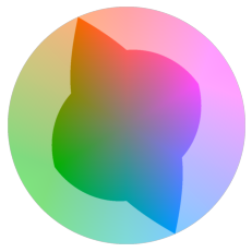
Gamut Mask in Krita.

In Krita, we start with a HSV (or HSL, HSY) color wheel. For the mask, the user may choose from a few predefined shape, or draw a custom version. In the UI there is a slider where you can adjust value/lightness/luma. More details can be found here.

Well this digital adaption look so natural and intuitive that I didn't have any doubt, until recently.

What Is Wrong? 

The first issue invovles the choice of the color wheel. In previous posts (1, 2) I discussed issues of value/brightness in HSV/HSL/HSY. However for gamut mask, we need something else, namely uniform distribution of the hues.

In the book Color and Light: A Guide for the Realist Painter, James mentioned that the traditional RYB color wheel suffers from uneven distribution of hues. The red-orange-yellow section is too "loose", while the green-blue secction is too "crowded".

Prior to modern color spaces, the Munsell color system was the best hue-chroma-value system that is perceptually uniform. Even today, the Munsell colors are often used to test modern color spaces. It is easy to observe the difference between HSL and CAM16UCS (a modern uniform color system), if we plot the Munsell colors:

Munsell Colors in HSL


Munsell Colors in CAM16UCS

The second issue is about chroma. Note that there is difference between saturation and chroma. Briefly speaking, chroma is independent and absolute, while saturation is relative and depends on hue and/or value.

In the digital version, when we adjust the V/L/Y channel, the H(ue) and S(aturation) channels remain the same. This means chroma would change along. (Well I didn't even mention the poor performance of uniformity in these models, the weird defintion of "saturation" in HSL and the horrendous stretching of chroma in HSY)

In the original version, however, James explicitly mentioned maintaining chroma when mixing colors. Well sometimes he also mentioned intensity or saturation, but I do believe he meant chroma. A solid evidence is that James obtained lighter/darker versions of the base colors by mixing other high-chroma colors, instead of with pure white/black. 

Next, I would justify my arguments by analyzing the idealized model.


2021-03-30

Notes on Color #6: Creating a Zorn Palette

Update: the palette for Krita is available here.

For beginners, limited palette is a useful tool for learning to use colors. Among many of those, the Zorn palette, used by Anders Zorn, seems popular in some ateliers.

There are a few variations of the Zorn palette. The version that I'm learning consists of the following base colors:

  • Ivory Black
  • Permanent White or Titanium White
  • Yellow Ochre
  • Cadmium Red Light
When painting, you are only allowed to obtain colors by mixing these base cases. Depsite of its simplicity, the palette is surprisingly powerful, especially for portrait painting.

Since I'm learning both painting and color theories, I find it interesting to make a digital version.

Mixing Paints

The process of mixing paints is rather complicated. It is somewhere between additive-average and subtractive. However the situation is simple because the Black and White has very few chroma, and the Red and Yellow are very close in the color space.

In this case we could get quite good estimation of the mixed color by taking (weighted) geoemtric means of the spectral reflectance curves. More details can be found here. A more realistic result can be obtained with ColorMixingTools. Here is a comparison, they look close enough.
Spectral Reflection Curves of Cadmium Red, Yellow Orche and their 1:1 geometric mean.

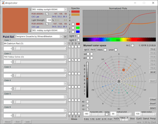
Mixing Cadmium Red and Yellow Orche using drop2color.


Then I plotted mixes of pairs of base colors in XYZ and CAM16UCS.

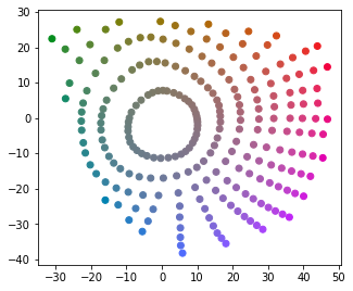
Mix of pairs of base colors in XYZ

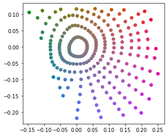
Mix of pairs of base colors in CAM16UCS

Interestingly, the edges look quite straight. This means we could even simply use linear combination as a good estimate. Note that linear combinations does make sense in term of mixing lights, and it is much easier to compute.

Computing the Zorn Color Space

Now the task is to compute all linear combinations of the colors. More accurately, we want all weighted arithmetic means of these colors. This is naturally the volume enclosed by the convex hull of the 4 colors.

The convex hull may be computed in XYZ or a linear RGB space. Note that since XYZ and linear RGB are just linear tranformation of each other, the result color space are essentially the same.

To me it was not trivial how to arrange the color space into a palette. Note that the Zorn color space is a 3d volume, but a palette is ususally 1d or 2d. After some research I decided to put the volume in CAM16UCS, then take slices of the volume at different luma's, which fit the way I intend to use it in painting.

At last, just for fun, I also computed the convext hull in CAM16UCS for comparison, which may or may not make any sense.

Here's the result:


While both versions look simliar, the XYZ version seems better.


Producing the Palette

Now the palette can be obtained by taking samples of the volume at grid points. Here are two slices.

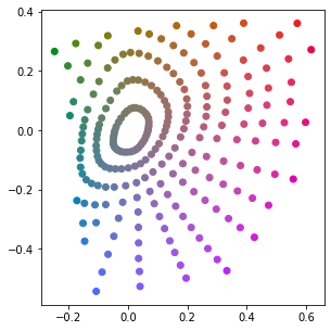
The Zorn Palette at J=35   
The Zorn Palette at J=65

I was also able to export the palette for Krita.

Zorn Palette for Krita.

Final Thoughts

While it is merely a quick hack with random decisions here and there. I reckon this palette would serve well in my learning of the palette.

The Zorn palette may be viewed as a simple specific version of color gamut masks, which I plan to study further. In fact I do have questions and complaints about popular implementations of gamut masks. For example, common implementations involve:
  • The HSV/HSL/HSY color wheel
  • A regular, fixed shape on the color wheel, regardless of the value.
However I don't find good color/math theories supporting these choices. As shown above, I expect the shape of the mask to be irregular and changing at different values.

On the other hand, probably it doesn't matter at all. After all this is merely a guide for artists. It is up to the artists to make decisions based on their knowledge and styles.

2021-03-28

Notes on Color #5: Projecting Munsell Colors

Before the digital era, the Munsell Color System was probably the best perceptually uniform color system with hue, chroma and value components. It is also used nowadays.

The 1943 Munsell renotations (with portion cut away).
Source: Wikipedia CC BY-SA 3.0

When reading the introduction page of Oklab, I learned about the idea of projecting Munsell colors into diffrent color space. I find it an intuitive and fun way to study color space. Who does not like colorful demos?

Here we have to assume the quality of the Munsell data, which might not be 100% scientific. Anways I think it should be good enough, as proved by generations of aritist.

With this assmption, we may examine munsell colors in the target color space, and observe the following:

- Do the points with same chroma form a perfect circle? Are they distributed evenly?
- Do the points with same hue form a straight line? Are they distributed evenly?
- For luminance/brightness, actually I assume decient color spaces are already good enough. 

The Results

Here are projections of Munsell colors with value = 5.

My farvorites: CAM16-UCS and Oklab. 


CAM16-UCS
Oklab

Others.

Note that some models are not even designed for perception. They are simply presented here for fun.

CIELAB
CIELUV
Hunter Lab

IPT
OSA UCS

SRLab2
YCbCr
CIEXYZ
xyY


HSV
HSL

Notes on Color #4: HSY

Previously I discussed why HSV and HSL are bad, despite that they are quite popular adopted by digital painting tools.

I learnd about HSY from Krita, which seems to solve a number of issues. Here I did some quick explorations in order to learn more about it's properties.

First of all, HSY is very similar to other HS* family members. The definition of H and S should be the same as in HSL. Y is for Luma, which is a weighted sum of (gamma-corrected) all three components. The weights reflect our brightness sensitivity of different wavelengths. The specific values depend on the actual primary colors.

Here's a HSY disk at Y=0.5, for sRGB.

HCY disk with Y=0.5

Comparing with HSV or HSL disk, this one looks smoother, and a bit "muddy" near the center. This means the Y value does predicts the actual luminance well. The gray version (converted via CIELAB) may verify this observation:
L(CIELAB) channel of the HCY disk.


So there is a huge improvement over other HS* models. It seems good enough for digital painting, right? Well, yes and no. I mean no.

The Two Lies

Well the "huge improment" part is true, but there are two lies above.

First of all, notice the "HCY" in the captions,  that was a not a typo. The distance to the center represents chroma rather than saturation.

Second, you may notice some lighter areas in the grey version, near the purple area and green area. That is not an illusion.

This changes the story entirely. Allow me to reveal the imperfect truth.

sRGB colors in the HCY disk where Y=0.5.
  
This weird shape represents all sRGB colors on the disk. At first I was quite sure that something is wrong in my code. Later I realized that if (r, g, b) has a luma of 0.5, then so does (1-r, 1-g, 1-b) , provided that the sum of the component weights is 1.

In the previous colorful version, the out-of-gamut colors were capped, therefore not accurate.

This weird shape is problematic, somtimes it is no longer possible to mix two colors by picking a point on the line segment. On the other hand, in Krita we do have a full-circle version:

HSY disk in Krita, with Y near 0.5


It appears more "muddy" here. If you examine the colors near the border, red-ish and blue-ish areas look fine, but other parts look gray-ish. 

In fact this version is obatained by stretching the HCY disk. Each radius is stretched to [0, 1] independently. This way the grey-ish area at the center appears much bigger than it is.

Personally I don't think this transformation makes much sense. Now the saturation value depends on both hue and brightness, so two saturation values are not really comparable. I think we should instead accept something like, the most "colorful yellow" is always brighter than the most "colorful blue"  (within a  (usual) RGB model). Therefore we should always be careful when shifting hues for high-chroma colors.


Notes on Color #3: Color Spaces

The first time I heard of the term "color space" was probably from some article about display color gamut/calibration. I learned that it is important for a display to achieve at least 100% sRGB, for digital painting or image processing. Well I didn't know what exactly "s" means here, but I got a feeling that it has something to do with the RGB values in HTML color codes.

A few color spaces
Source: Wikipedia CC BY-SA 3.0


The diagram could be very confusing. I had a few questions, which I think I can answer today:

Why does it look like a weird 2d shape, instead of a 3d volume?
It is a 2d shape, which is a slice of the 3d space at a constant luminance.
More specifically, this is a sliced xy space at a specific value of Y.

Why does the sRGB color space appear as a triangle?
The sRGB color space is generated by 3 primary colors, which corresponds to the 3 vertices of the triangle. Moreover, for any 2 colors, all available colors obtained by mixing these 2 colors (with different ratios) corresponds to all points on the line segment that connects the 2 points.

Assuming RGB values, (1, 1, 0) may be obtained by mixing (1, 0, 0) and (0, 1, 0). However they are not on a line.
The idea is that luminance and chromaticity may be examined independently. (1, 1, 0) would have the same chromaticity as (0.5, 0.5, 0), which is on the line segment connecting (1, 0, 0) and (0, 1, 0).
However, note that (0.5, 0.5, 0) is not necessarily the middle point on the xy diagram. Simliarly, the white point is not necessarily the gravicity center of the triangle.


This wiki page lists and compares a number of color spaces. Here are my notes:

CAM - Color Appearance Model, which describes human perceiption of colors. These models could be useful for choosing colors. Difficult to compute. Examples: CAM16, Oklab, CIECAM02, CIELAB.

UCS - Uniform Color Space, in which the distance between two color points reflects the color difference perceived by human. These models could be useful for generating gradients. Difficult to compute. Examples: CAM16-UCS, OSA-UCS.

RGB - Generated with 3 primary colors. It is widely used for display devices and media encoding. The linear version (without gamma correction/encoding) is also useful for mixing colors (lights) and rendering. Easy to compute. Examples: sRGB, Adobe RGB.

HSV, HSL, HSI, HSY - Cylindrical transformations of RGB. Widely used for historical reasons. Easy to compuate but very inaccurate. 

Finally, I found the following videos very helpful:

2021-03-24

Notes on Color #2: What's wrong with HSV / HSL ?

Palette and Color pickers

The word "palette" typically means a set of colors to choose from. In the digital world it means something similar, especially on older systems which support very small number of (e.g. 16, 256) colors.

The first "advanced" color picker I saw was propably the color picker in Microsoft software, e.g. Paint, Word etc. 

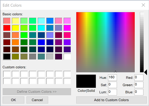
Color Picker in Microsoft Windows,
which has not changed much since Windows 3.1. 

At the time I was very excited by the colorful UI, and I had lots of fun exploring the colors. However, at that time I barely understood the numbers for red, green and blue, and by no means did I understood the other set of numbers: hue, sat and lum.

Later I came across this "ring + triangle" or "ring + rectangle" color pickers, mostly in digital painting software. 

HSV Color Picker in Krita

At that time I didn't fully understand the differences of V, B or L, neither did I understand the differences between the rectangle version and the triangle version. Anyways I found it an intuitive way of arranging colors. This UI also helped me understand the concepts of hue, staturation and brightness/value.


The Color Models

Mostly because we have 3 types of color receptors, all visible colors may be organized in a 3d space. It might not be obvious at first,  but we could get some hints when using digital colors, after all the colors are typically represented by three components: R, G and B.

The HSV and HSL models are simple conversions of the RGB model. It's supposed to be more intuitive, because hue, saturation and values are defined based on visual receptions. On the other hand, RGB is designed to be straightforword for display devices.

The HSL cylinder.
Source: Wikipedia CC BY-SA 3.0

The HSV cylinder.
Source: Wikipedia CC BY-SA 3.0

I had thought that the HSV model is the color model for digital painting. Yet over the years I did find some strange effects here and there, but I was so convinced that it was due to my immature understanding of color theories. Well, now I know that it was probably 90% true. This color model is not perfect itself, either.


The Value Makes No Sense

Here is the HSV disk at maximum value:
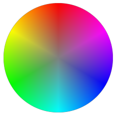
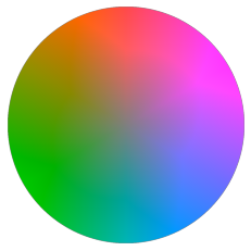
HSV disk with max value

In HSV the V component is defined as the max of 3 components. With this definition #ffffff and #ff0000 have the same value, which does not make any sense. 

We all know that the 3 components R, G and B loosely represents the luminous level of the 3 corresponding RGB LEDs, if we ignore the details like gamma correction, color profile etc. Therefore pure white #ffffff is the ONLY color that achieves the maximum value, which is the sum of values of #ff0000, #00ff00 and #0000ff, assuming linear value scale.

The CIELAB color space is known to have a good estimate of value. It's easier to see the unevenness, if we convert the HSV disk to grey using CIELAB (by setting a and b to 0). The center point is much brighter than other places.
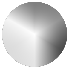
L(CIELAB) channel of the HSV disk

In the HSL color model, the lightness component is defined as the mid-range of the 3 components. (I had thought it is the arithmetic mean, which is in fact the HSI model.) In this model #ffffff and #ff0000 no longer have the same value (lightness).

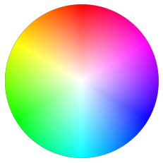
The HSL disk where lightness=0.5

Note that brightness/value/lightness in general reflects the overall luminous energy, while chroma in general reflects the bias of the 3 color receptors. Therefore both values cannot achieve max at the same time, which means the most "colorful" (i.e. max chroma) color cannot be the brightest.

The issue with HSL model is, the 3 primary colors, #ff0000, #00ff00 and #0000ff have the same lightness. This is not true because our eyes are not equally sensitive to light of different wavelengths.

Photopic relative brightness sensitivity of the human visual system as a function of wavelength.
Source: Wikipedia CC BY-SA 3.0


This can be verified by converting the HSL disk to grey:

L(CIELAB) channel of the HSL disk

Note that the green area appears brighter than other places. In fact it can also be observed in the grey version of the HSV disk.

Does It Matter?

So now we know that the value/brightness/lightness is off, it does not necessary represent our actual color reception. Does it matter? How?

In digital painting and image processing, it is very common to adjust images with the following operations:
  • Hue / Saturation correction
  • Color balance
  • Brightness/Contract adjustment
  • Levels adjustment
  • Curves adjustment
In fact all of them are different form of curves on different channels.

If we perform these operations based on HSV/HSL models, the lightness channel may often change unexpectedly. Some quick examples:

By offseting the hue channel, we may change #00ff00 (green) to #0000ff (blue). It appears that saturation and lightness/value are not changed, but green looks brighter than blue.

When we apply some level mapping or curves on brightness, #00ff00 and #0000ff will be considered to have same values. However since the preceived values are not the same, the mapping result would look wrong.

Other Issues

Out of all three channels, value is the most important. One evidence is that we are able to enjoy monochromatic images and videos.

Besides value, we may also observe issues on the other 2 channels:

- Uneven Hue. On the color wheels we can see some "bands" near the primary colors.
- Dependent Saturation. Saturation (instead of chroma) often depends on brightness, which could be sometimes ambiguous. For example, what is the satuarion of pure white, is it 0 or 1(max)?

Alternatives

It is clear now that HSV and HSL are quite flawed. The only advantage is probably that they are fast to compute. But I think they should not be used in practice.

CIELAB should perform better in many cases, but it has issues with hue, especially near blue.

CIELUV is somewhat simliar, but not commonly available in software.

Oklab is fairly new, it is claimed to perform better than CIELAB, which seems so according to some reviews.

HSY is similar to HSV and HSL. It achieves better perceptually relevant by assigning different weight on the RGB components. It is available in Krita, but I don't often see it in other software. While it is still far from perfect, I reckon it should perform good enough in digital painting and other common scenarios.

My plan is to explore more on CIELAB, Oklab and HSY.