2021-03-30

Notes on Color #6: Creating a Zorn Palette

Update: the palette for Krita is available here.

For beginners, limited palette is a useful tool for learning to use colors. Among many of those, the Zorn palette, used by Anders Zorn, seems popular in some ateliers.

There are a few variations of the Zorn palette. The version that I'm learning consists of the following base colors:

  • Ivory Black
  • Permanent White or Titanium White
  • Yellow Ochre
  • Cadmium Red Light
When painting, you are only allowed to obtain colors by mixing these base cases. Depsite of its simplicity, the palette is surprisingly powerful, especially for portrait painting.

Since I'm learning both painting and color theories, I find it interesting to make a digital version.

Mixing Paints

The process of mixing paints is rather complicated. It is somewhere between additive-average and subtractive. However the situation is simple because the Black and White has very few chroma, and the Red and Yellow are very close in the color space.

In this case we could get quite good estimation of the mixed color by taking (weighted) geoemtric means of the spectral reflectance curves. More details can be found here. A more realistic result can be obtained with ColorMixingTools. Here is a comparison, they look close enough.
Spectral Reflection Curves of Cadmium Red, Yellow Orche and their 1:1 geometric mean.

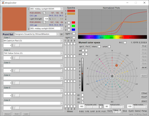
Mixing Cadmium Red and Yellow Orche using drop2color.


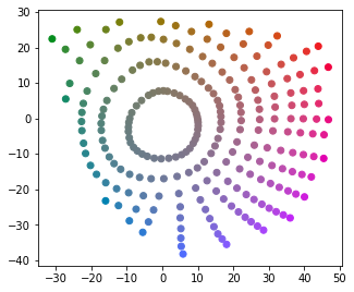
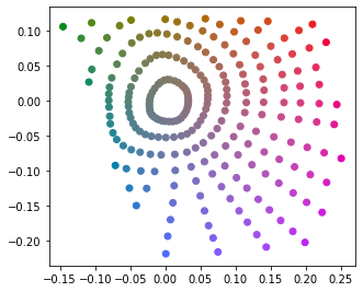
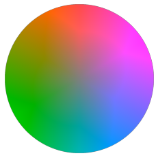
Then I plotted mixes of pairs of base colors in XYZ and CAM16UCS.

Mix of pairs of base colors in XYZ

Mix of pairs of base colors in CAM16UCS

Interestingly, the edges look quite straight. This means we could even simply use linear combination as a good estimate. Note that linear combinations does make sense in term of mixing lights, and it is much easier to compute.

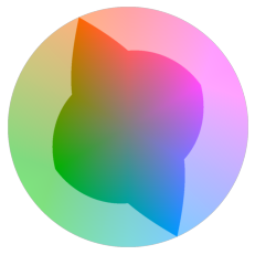
Computing the Zorn Color Space

Now the task is to compute all linear combinations of the colors. More accurately, we want all weighted arithmetic means of these colors. This is naturally the volume enclosed by the convex hull of the 4 colors.

The convex hull may be computed in XYZ or a linear RGB space. Note that since XYZ and linear RGB are just linear tranformation of each other, the result color space are essentially the same.

To me it was not trivial how to arrange the color space into a palette. Note that the Zorn color space is a 3d volume, but a palette is ususally 1d or 2d. After some research I decided to put the volume in CAM16UCS, then take slices of the volume at different luma's, which fit the way I intend to use it in painting.

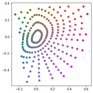
At last, just for fun, I also computed the convext hull in CAM16UCS for comparison, which may or may not make any sense.

Here's the result:


While both versions look simliar, the XYZ version seems better.


Producing the Palette

Now the palette can be obtained by taking samples of the volume at grid points. Here are two slices.

The Zorn Palette at J=35   
The Zorn Palette at J=65

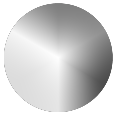
I was also able to export the palette for Krita.

Zorn Palette for Krita.

Final Thoughts

While it is merely a quick hack with random decisions here and there. I reckon this palette would serve well in my learning of the palette.

The Zorn palette may be viewed as a simple specific version of color gamut masks, which I plan to study further. In fact I do have questions and complaints about popular implementations of gamut masks. For example, common implementations involve:
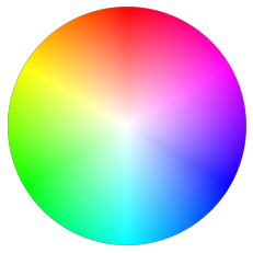
  • The HSV/HSL/HSY color wheel
  • A regular, fixed shape on the color wheel, regardless of the value.
However I don't find good color/math theories supporting these choices. As shown above, I expect the shape of the mask to be irregular and changing at different values.

On the other hand, probably it doesn't matter at all. After all this is merely a guide for artists. It is up to the artists to make decisions based on their knowledge and styles.

2021-03-28

Notes on Color #5: Projecting Munsell Colors

Before the digital era, the Munsell Color System was probably the best perceptually uniform color system with hue, chroma and value components. It is also used nowadays.

The 1943 Munsell renotations (with portion cut away).
Source: Wikipedia CC BY-SA 3.0

When reading the introduction page of Oklab, I learned about the idea of projecting Munsell colors into diffrent color space. I find it an intuitive and fun way to study color space. Who does not like colorful demos?

Here we have to assume the quality of the Munsell data, which might not be 100% scientific. Anways I think it should be good enough, as proved by generations of aritist.

With this assmption, we may examine munsell colors in the target color space, and observe the following:

- Do the points with same chroma form a perfect circle? Are they distributed evenly?
- Do the points with same hue form a straight line? Are they distributed evenly?
- For luminance/brightness, actually I assume decient color spaces are already good enough. 

The Results

Here are projections of Munsell colors with value = 5.

My farvorites: CAM16-UCS and Oklab. 


CAM16-UCS
Oklab

Others.

Note that some models are not even designed for perception. They are simply presented here for fun.

CIELAB
CIELUV
Hunter Lab

IPT
OSA UCS

SRLab2
YCbCr
CIEXYZ
xyY


HSV
HSL

Notes on Color #4: HSY

Previously I discussed why HSV and HSL are bad, despite that they are quite popular adopted by digital painting tools.

I learnd about HSY from Krita, which seems to solve a number of issues. Here I did some quick explorations in order to learn more about it's properties.

First of all, HSY is very similar to other HS* family members. The definition of H and S should be the same as in HSL. Y is for Luma, which is a weighted sum of (gamma-corrected) all three components. The weights reflect our brightness sensitivity of different wavelengths. The specific values depend on the actual primary colors.

Here's a HSY disk at Y=0.5, for sRGB.

HCY disk with Y=0.5

Comparing with HSV or HSL disk, this one looks smoother, and a bit "muddy" near the center. This means the Y value does predicts the actual luminance well. The gray version (converted via CIELAB) may verify this observation:
L(CIELAB) channel of the HCY disk.


So there is a huge improvement over other HS* models. It seems good enough for digital painting, right? Well, yes and no. I mean no.

The Two Lies

Well the "huge improment" part is true, but there are two lies above.

First of all, notice the "HCY" in the captions,  that was a not a typo. The distance to the center represents chroma rather than saturation.

Second, you may notice some lighter areas in the grey version, near the purple area and green area. That is not an illusion.

This changes the story entirely. Allow me to reveal the imperfect truth.

sRGB colors in the HCY disk where Y=0.5.
  
This weird shape represents all sRGB colors on the disk. At first I was quite sure that something is wrong in my code. Later I realized that if (r, g, b) has a luma of 0.5, then so does (1-r, 1-g, 1-b) , provided that the sum of the component weights is 1.

In the previous colorful version, the out-of-gamut colors were capped, therefore not accurate.

This weird shape is problematic, somtimes it is no longer possible to mix two colors by picking a point on the line segment. On the other hand, in Krita we do have a full-circle version:

HSY disk in Krita, with Y near 0.5


It appears more "muddy" here. If you examine the colors near the border, red-ish and blue-ish areas look fine, but other parts look gray-ish. 

In fact this version is obatained by stretching the HCY disk. Each radius is stretched to [0, 1] independently. This way the grey-ish area at the center appears much bigger than it is.

Personally I don't think this transformation makes much sense. Now the saturation value depends on both hue and brightness, so two saturation values are not really comparable. I think we should instead accept something like, the most "colorful yellow" is always brighter than the most "colorful blue"  (within a  (usual) RGB model). Therefore we should always be careful when shifting hues for high-chroma colors.


Notes on Color #3: Color Spaces

The first time I heard of the term "color space" was probably from some article about display color gamut/calibration. I learned that it is important for a display to achieve at least 100% sRGB, for digital painting or image processing. Well I didn't know what exactly "s" means here, but I got a feeling that it has something to do with the RGB values in HTML color codes.

A few color spaces
Source: Wikipedia CC BY-SA 3.0


The diagram could be very confusing. I had a few questions, which I think I can answer today:

Why does it look like a weird 2d shape, instead of a 3d volume?
It is a 2d shape, which is a slice of the 3d space at a constant luminance.
More specifically, this is a sliced xy space at a specific value of Y.

Why does the sRGB color space appear as a triangle?
The sRGB color space is generated by 3 primary colors, which corresponds to the 3 vertices of the triangle. Moreover, for any 2 colors, all available colors obtained by mixing these 2 colors (with different ratios) corresponds to all points on the line segment that connects the 2 points.

Assuming RGB values, (1, 1, 0) may be obtained by mixing (1, 0, 0) and (0, 1, 0). However they are not on a line.
The idea is that luminance and chromaticity may be examined independently. (1, 1, 0) would have the same chromaticity as (0.5, 0.5, 0), which is on the line segment connecting (1, 0, 0) and (0, 1, 0).
However, note that (0.5, 0.5, 0) is not necessarily the middle point on the xy diagram. Simliarly, the white point is not necessarily the gravicity center of the triangle.


This wiki page lists and compares a number of color spaces. Here are my notes:

CAM - Color Appearance Model, which describes human perceiption of colors. These models could be useful for choosing colors. Difficult to compute. Examples: CAM16, Oklab, CIECAM02, CIELAB.

UCS - Uniform Color Space, in which the distance between two color points reflects the color difference perceived by human. These models could be useful for generating gradients. Difficult to compute. Examples: CAM16-UCS, OSA-UCS.

RGB - Generated with 3 primary colors. It is widely used for display devices and media encoding. The linear version (without gamma correction/encoding) is also useful for mixing colors (lights) and rendering. Easy to compute. Examples: sRGB, Adobe RGB.

HSV, HSL, HSI, HSY - Cylindrical transformations of RGB. Widely used for historical reasons. Easy to compuate but very inaccurate. 

Finally, I found the following videos very helpful:

2021-03-24

Notes on Color #2: What's wrong with HSV / HSL ?

Palette and Color pickers

The word "palette" typically means a set of colors to choose from. In the digital world it means something similar, especially on older systems which support very small number of (e.g. 16, 256) colors.

The first "advanced" color picker I saw was propably the color picker in Microsoft software, e.g. Paint, Word etc. 

Color Picker in Microsoft Windows,
which has not changed much since Windows 3.1. 

At the time I was very excited by the colorful UI, and I had lots of fun exploring the colors. However, at that time I barely understood the numbers for red, green and blue, and by no means did I understood the other set of numbers: hue, sat and lum.

Later I came across this "ring + triangle" or "ring + rectangle" color pickers, mostly in digital painting software. 

HSV Color Picker in Krita

At that time I didn't fully understand the differences of V, B or L, neither did I understand the differences between the rectangle version and the triangle version. Anyways I found it an intuitive way of arranging colors. This UI also helped me understand the concepts of hue, staturation and brightness/value.


The Color Models

Mostly because we have 3 types of color receptors, all visible colors may be organized in a 3d space. It might not be obvious at first,  but we could get some hints when using digital colors, after all the colors are typically represented by three components: R, G and B.

The HSV and HSL models are simple conversions of the RGB model. It's supposed to be more intuitive, because hue, saturation and values are defined based on visual receptions. On the other hand, RGB is designed to be straightforword for display devices.

The HSL cylinder.
Source: Wikipedia CC BY-SA 3.0

The HSV cylinder.
Source: Wikipedia CC BY-SA 3.0

I had thought that the HSV model is the color model for digital painting. Yet over the years I did find some strange effects here and there, but I was so convinced that it was due to my immature understanding of color theories. Well, now I know that it was probably 90% true. This color model is not perfect itself, either.


The Value Makes No Sense

Here is the HSV disk at maximum value:
HSV disk with max value

In HSV the V component is defined as the max of 3 components. With this definition #ffffff and #ff0000 have the same value, which does not make any sense. 

We all know that the 3 components R, G and B loosely represents the luminous level of the 3 corresponding RGB LEDs, if we ignore the details like gamma correction, color profile etc. Therefore pure white #ffffff is the ONLY color that achieves the maximum value, which is the sum of values of #ff0000, #00ff00 and #0000ff, assuming linear value scale.

The CIELAB color space is known to have a good estimate of value. It's easier to see the unevenness, if we convert the HSV disk to grey using CIELAB (by setting a and b to 0). The center point is much brighter than other places.
L(CIELAB) channel of the HSV disk

In the HSL color model, the lightness component is defined as the mid-range of the 3 components. (I had thought it is the arithmetic mean, which is in fact the HSI model.) In this model #ffffff and #ff0000 no longer have the same value (lightness).

The HSL disk where lightness=0.5

Note that brightness/value/lightness in general reflects the overall luminous energy, while chroma in general reflects the bias of the 3 color receptors. Therefore both values cannot achieve max at the same time, which means the most "colorful" (i.e. max chroma) color cannot be the brightest.

The issue with HSL model is, the 3 primary colors, #ff0000, #00ff00 and #0000ff have the same lightness. This is not true because our eyes are not equally sensitive to light of different wavelengths.

Photopic relative brightness sensitivity of the human visual system as a function of wavelength.
Source: Wikipedia CC BY-SA 3.0


This can be verified by converting the HSL disk to grey:

L(CIELAB) channel of the HSL disk

Note that the green area appears brighter than other places. In fact it can also be observed in the grey version of the HSV disk.

Does It Matter?

So now we know that the value/brightness/lightness is off, it does not necessary represent our actual color reception. Does it matter? How?

In digital painting and image processing, it is very common to adjust images with the following operations:
  • Hue / Saturation correction
  • Color balance
  • Brightness/Contract adjustment
  • Levels adjustment
  • Curves adjustment
In fact all of them are different form of curves on different channels.

If we perform these operations based on HSV/HSL models, the lightness channel may often change unexpectedly. Some quick examples:

By offseting the hue channel, we may change #00ff00 (green) to #0000ff (blue). It appears that saturation and lightness/value are not changed, but green looks brighter than blue.

When we apply some level mapping or curves on brightness, #00ff00 and #0000ff will be considered to have same values. However since the preceived values are not the same, the mapping result would look wrong.

Other Issues

Out of all three channels, value is the most important. One evidence is that we are able to enjoy monochromatic images and videos.

Besides value, we may also observe issues on the other 2 channels:

- Uneven Hue. On the color wheels we can see some "bands" near the primary colors.
- Dependent Saturation. Saturation (instead of chroma) often depends on brightness, which could be sometimes ambiguous. For example, what is the satuarion of pure white, is it 0 or 1(max)?

Alternatives

It is clear now that HSV and HSL are quite flawed. The only advantage is probably that they are fast to compute. But I think they should not be used in practice.

CIELAB should perform better in many cases, but it has issues with hue, especially near blue.

CIELUV is somewhat simliar, but not commonly available in software.

Oklab is fairly new, it is claimed to perform better than CIELAB, which seems so according to some reviews.

HSY is similar to HSV and HSL. It achieves better perceptually relevant by assigning different weight on the RGB components. It is available in Krita, but I don't often see it in other software. While it is still far from perfect, I reckon it should perform good enough in digital painting and other common scenarios.

My plan is to explore more on CIELAB, Oklab and HSY.

2021-03-15

Notes on Color #1: Misconceptions

In my childhood I learned about the three primary colors: red, yellow and blue. They are "primary" because any other color may be obtained by mixing these colors, on the other hand the primary colors cannot be obtained in this way.

Years later I learned about RGB and HSL for UI and digital painting. At that point I thought I've got a solid understanding of the colors, until now.

Having been learning color therories for a few weeks, I realized that how much I do not know about colors.

This is the first study notes on color theory, which lists a few misconceptions that I have had for years.


Color is a physical property of lights or objects. Right?

Right and wrong. When we say "the apple is red", we actually mean "under the standard daylight illuminant, the spectrum reflected by the apple is perceived similarly as other objects that are commonly known as red".

The light source and the spectral reflectance are apparently important, yet the observer is also a decisive factor. Most of us humans are trichromats, we have 3 types of color receptors. The color we "see" reflects the stimuli of the 3 color receptors. Other species may have fewer or more. Mantis shrimps have 12-16. Therefore a human and a mantis shrimp may not agree on the "color" of an apple. 

Further, some humans are dichromats or tetrachromats. Even trichromatic humans may preceive the colors differently. 

Therefore color is more psycophysical. A standard observer is commonly used to represent an average human's chromatic response.


The 3 types of human cone cells can detect red, green and blue lights independently. Right?

Wrong. The L and M cone cells cover almost the entire visible spectrum. With a weak stimui of a M cone cell, we cannot determine whether it comes from a weak green-ish light or a strong blue-ish light.

Human cone cell response curves.
Source: Wikipedia CC BY-SA 3.0

In fact, the L cone cell has maximal sensitivity around 560-580nm, which is not even "red".

CIE xy color diagram.
Source: Wikipedia CC BY-SA 3.0

Comparing with a pure white object, a 50%-grey object is 50% less effecient in reflecting lights. Right?


Wrong. Our color vision is not linear. The (reflected) luminance of a 50%-grey object is about 18% of pure/reference white.

Munsell Renotation and other curves.
Source: Wikipedia CC BY-SA 2.5